
What a Branded Audit Looks Like
This page is a walkthrough of a real branded audit, made for a fictional agency, so you can see what you would actually send a prospect before you try Zyenta on a client of your own. It is a branded ecommerce audit report end to end: the cover, the summary, the findings, the roadmap, the methodology page, and the closing page. Nothing here is a mockup or a template with placeholder text. It is a real audit of a real Shopify store, with the store anonymized and the agency name swapped in.
What the sample is, and what is left out
The sample audits a real Shopify store. It was generated for a fictional agency called Fernhollow Growth, and the agency's logo, name and contact line appear throughout, the same way your own would. The store itself is anonymized, because publishing it here would identify a real business.
One thing is missing because of that: annotated screenshots. A normal audit includes them, marked up against the specific page they were captured from. We left them out of this sample because an annotated screenshot of a real store's homepage or checkout is often enough to identify the store even without a name attached. Everything else in the sample, the structure, the findings, the language, the roadmap, is what a client would receive.
The cover
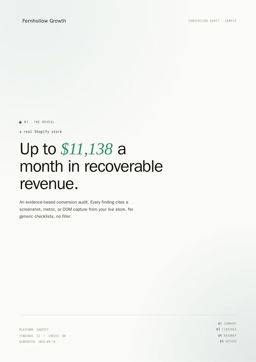
The cover is the first thing a prospect sees, so it carries the agency's branding, not Zyenta's. Fernhollow Growth's logo, name and contact line sit at the top. Below that is a headline built around the upper end of the estimated monthly recoverable revenue for this store, the platform audited, and the date the audit was generated. A contents list runs down the page so the reader knows what is coming.
The executive summary
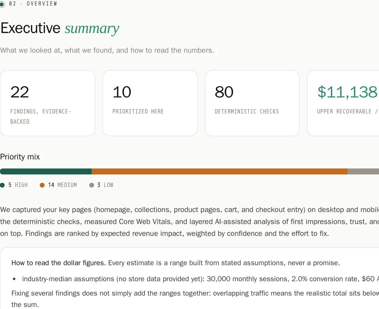
The summary is where a skeptical reader decides whether to keep reading. It states the number of evidence-backed findings, how many of those are prioritized, and the mix of high, medium and low priority findings. It lists what was captured: which pages, on which devices. And it explains how to read the dollar figures in the report, including the assumptions used when the store itself has shared no data. This matters because a dollar range without its assumptions is just a guess dressed up as a number. Here, the assumptions are printed, not hidden.
The findings
This is the body of the report. Every finding here is tied to something the audit actually captured: a screenshot, a metric, or a page capture, and findings without that evidence do not make it into the report at all. Each one shows a severity out of 5, a monthly dollar range, impact and effort labels, what was seen, why it matters, and the fix.
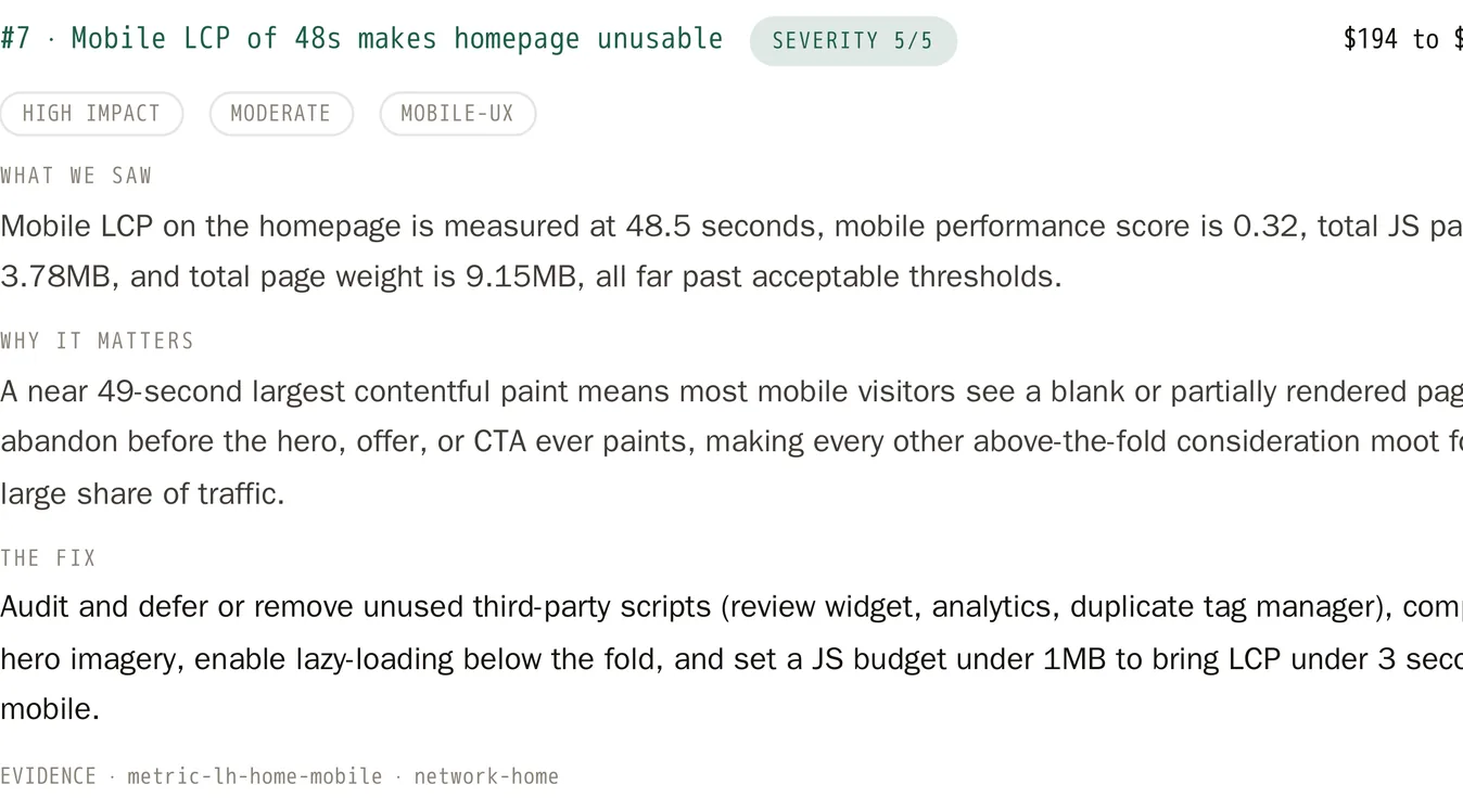
We are not quoting finding titles from the sample here. A few of them are worded to describe the healthy state rather than the problem found, which is a stylistic choice in how the report presents things, but quoted out of context on a blog page they would read backwards. Open the sample to see the actual wording in place.
The roadmap
After the findings, the roadmap regroups the same fixes by effort instead of by page or severity. Quick wins that a client could do this week come first. Moderate work that takes a month comes after. Nothing new is introduced here, it is the same findings, reorganized so an agency or a client can plan a sprint around them instead of reading top to bottom.
The methodology and limits page
This page states plainly how the audit was produced, what the dollar figures are and are not, and what the audit could not see: anything behind payment, analytics, email flows and ad traffic quality. This is a conversion audit template for agencies, not an all-seeing one, and the report says so on its own methodology page instead of leaving it for a client to discover later. If you are pitching alongside checks on things like Shopify abandoned cart email flows or Shopify A/B testing, this page is where you would say so, since neither is inside what the audit itself can see.
The closing page
The closing page carries Fernhollow Growth's name and contact details. Zyenta does not appear on it. In an audit run under an agency's own account, this is where a prospect would find the agency's information again, at the end of a report that never told them who actually generated it, unless the agency chooses to turn a "Powered by Zyenta" line on.
How to read a finding
Each finding is built from the same six parts, in the same order, on purpose.
Severity, out of 5, gives a quick read on how serious the issue is relative to everything else in the report. The monthly dollar range gives a rough sense of what the issue might be costing, built from assumptions stated in the summary, for prioritizing which fixes to do first, not a promise of what fixing it will return. Impact and effort labels let you sort work without rereading every line. What was seen states the observation itself. Why it matters connects that observation to the store's revenue or trust. The fix is the recommended action. And the evidence citation ties the whole thing back to a screenshot, a metric, or a page capture, so nothing in the finding is asserted without something behind it.
If you want the fuller mechanics of how findings get built and accepted, see How the Zyenta Conversion Audit Works and What an Evidence-Based CRO Audit Actually Finds.
Using a report like this with a prospect
A report like this works best as a conversation starter, not a closing argument. It gives you specific, evidenced things to point to on a prospect's own store, instead of a generic pitch about conversion rate optimization. You can walk a prospect through the summary, pick two or three findings that match what you already suspected about their store, and let the roadmap set the agenda for a first project.
It will not do the selling for you. It does not promise a lift in conversion rate or revenue, and it should not be presented as if it does. What it gives you is a document with real severity ratings, real evidence, and a stated methodology, which is a different thing to hand a prospect than a slide deck built from a quick manual look at their homepage. If your prospect runs a category page or a checkout flow that looks a lot like patterns covered elsewhere on this blog, for instance Shopify Checkout Optimization: Cut Friction or Shopify Mobile Conversion Optimization, the audit findings and those guides tend to reinforce each other well in a pitch.
Check pricing if you want to see what running one of these under your own brand actually involves.
Try it on a prospect
Start a free trial from the pricing page, where the plans are listed.